
It's enough to drive you insane and, for some, enough to put you off on Android development entirely.
But don't despair! Follow these tips and you will be making layouts in a flash. You may even learn to love Android XML Layouts.
This tutorial assumes that you have the Eclipse IDE set up for Android development, and know how to make a "hello world" application. For more detailed instructions on how to do that, visit this link http://developer.android.com/guide/developing/eclipse-adt.html
Dom's Steps:
1. Prototype on Paper
This is a crucial step. It can help to organize your thoughts and lead to less headaches and frustrations when you actually start to design for real. One strategy is to used a notecard for the layout sketch. Notecards provide a rough approximation of the size of an Android smartphone.
 |
| A notecard next to an Android phone |
If you want to be more organized, I recommend using a notebook or a sketchbook so you can keep multiple layouts for a single app together.
For this tutorial we are going to pretend that we are creating a layout for part of a simple twitter application. The completed sketch is shown below.
 |
| A sketch of the layout |
2. Start thinking in terms of Linear Layouts and Views
Now that you have a sketch of what you want your layout to look like, start picturing the pieces of the drawing as views.
An Android layout is made up of views. Views are components like Buttons, Images, and Text Inputs. These views can organized in a number of sub layouts.
I recommend sticking using LinearLayouts to organize your views. LinearLayouts are simple, easy to modify, and can handle mostly anything. A lot of times it seems easy to think in terms of tables, but Table Layouts are not as flexible, and will usually end up causing problems and frustration as you try to modify them. TableLayouts force equal column width, and make it difficult to span columns.
3. Start a New Layout in Eclipse.
To start, create a simple "Hello World" type application. See this tutorial for more information. I chose to create an Android 1.5 project, but you can choose a different version if you like.
In the project explorer right click on the layout folder and select "New Android XML File" Type in layout.xml as the name, and make sure the type of resource selected is layout.
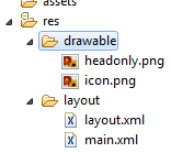 |
| The layout folder in the project explorer |
The WYSIWYG in Eclipse can be difficult at times but it makes designing layouts easier by giving you the outline view on the right, and the property list editor at the bottom. Click the element named LinearLayout in the outline view.
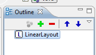 | |
| The outline view |
Now you can easily change the properties associated with the outline view from the properties view. The properties view is generally located at the bottom of the screen, next to the console output. If you can't see it go to Window->Show View->Other...->General->Properties.

Make sure the following properties are set for the outline view.
Misc->Layout Height: Fill Parent
Misc->Layout Width: Fill Parent
Orientation: Vertical
Now set the background property to #ffffff. The background should turn white. You can enter any valid hexadecimal color code to set the background.
4. Add the Views for the First Row
Now that we have the base layout set, we want to add another LinearLayout to hold the views for the first row. Click the plus button on the outline view to add another LinearLayout.
Note: At the time of the publishing of this article the current version of the Android Developer Tools does not include the plus, up arrow, and down arrow buttons. It is currently unclear whether this was intentional or a bug. You can still add components by dragging them from the list on the left, onto the preview display on the right.
 |
| Screenshot showing the list of views to add on the left, and the display preview in the middle |
Set the following properties.
Orientation: Horizontal
Misc->Layout Width: Fill Parent
ID's should be unique within an xml layout file, but they do not have to be unique among all the xml layout files. When you add an element, the sdk will automatically generate a valid ID for the element, but it can be helpful to change the id to a more recognizable name.
Now add the views to the first row. Click the plus button to add an ImageView. Click the plus button again to add a TextView. Use the up and down arrows to adjust the order of the views and make sure they have the proper parent element.
The outline view should now look like this.

Copy the following image to the drawable directory of project. Name it headonly.png
 |
| headonly.png |
Depending on what target version (Android 1.5, 1.6, 2.0, etc...) of the Android OS you have selected, you will also notice that they place three different folders as the drawable directory: drawable-hdpi, drawable-ldpi, and drawable-mpdi. This stand for high, medium and low density-independent pixel. And were designed to further customize the applications depending on the type of phone (some support better graphics). To learn more please visit: http://developer.android.com/guide/practices/screens_support.html.
For now we'll be storing our images under the drawable-hpdi folder. Even though the picture is in a specific folder (hdpi) set the source to @drawable/headonly and Android will figure out where to look for the image.
Now set a few of the properties for the views you just added.
ImageView01->Padding: 7dip
ImageView01->Src: @drawable/headonly
TextView01->Text color: #000000
TextView01->Text size: 30dip
TextView01->Text: Twitter Name
TextView01->Misc->Layout gravity: Center
TextView01->Misc->Layout margin left: 10dip
The layout should look like this now.
 |
| The current progress of the layout |
If you are having problems placing the components make sure the parent layers have the right settings. One possible problem is having the parent layer set up to get the height of the parent instead of wrapping, which made the text appear in the middle of the screen.
What is DIP?
DIP stands for density independent pixels. Since different devices can have different dpi's, specifying measurements in DIP instead of pixels can help ensure a more consistent look and feel among different devices.
5. Adding the ListView
ListViews are one of the most versatile Android components. They let you combine may different items that have a similar layout into a object that has built in scroll and flick capabilities.
We will add the ListView to the layout in this tutorial. Populating the ListView with actual data is handled programmatically and beyond the scope of this tutorial.
Select LinearLayout from the outline window and then drag and drop the ListView. Now LinearLayout is the parent of ListView. If the arrows on the outline view are visible (see earlier note) you can use them to adjust the hierarchy of the views so that the parent of the ListView01 is LinearLayout.
Set the following property.
ListView01->Misc->Layout Weight: 1
Setting the layout weight as a value of 1 tells the list view to take up all the remaining available space.
6. Adding the Bottom Row
Select the top LinearLayout and drag and drop another linear layout. By default it will go to the end of the list. Set the following properties.
Orientation: Horizontal
Misc->Layout Width: Fill Parent
ID: @+id/ButtonLayout
 |
| Screenshot of where to change the id |
This linear layout should be underneath the ListView in the Orientation View, and have this new LinearLayout as its parent. Feel free to rename this LinearLayout as
Add three buttons to ButtonLayout. Set the following property for all the buttons.
Layout weight: 1
Layout width: 100dip
Set the text for the three buttons to be Share, Search, and Retweet. By setting the weights and the widths the same, the three buttons should equally share the width of the available screen.
A note about adding the buttons with Drag and Drop
After setting up the properties of the linear layout if you try to drag and drop the buttons it won't work, they won't be added as the child of the last linear layout. So here is Silvia's trick: for the ButtonLayout choose the layout height to be the same as the parent. Now if you select it and drag and drop the buttons, these will be added in the right hierarchy. It is important that as soon as you finished adding the buttons you return the button layout to wrap layout height.
6. The Finished Layout
The finished layout should look like this.
 |
| The finished layout |
The complete xml for the layout is pasted below. When you are using Eclipse to view the xml, pressing Ctrl+Shift+f will auto format the xml. to make it look nicer.
The full xml of the layout:
<?xml version="1.0" encoding="utf-8"?>
<LinearLayout xmlns:android="http://schemas.android.com/apk/res/android"
 android:orientation="vertical" android:layout_height="fill_parent"
 android:layout_width="fill_parent" android:background="#ffffff">
 <LinearLayout android:layout_width="wrap_content"
  android:layout_height="wrap_content" android:id="@+id/LinearLayoutFirstRow">
  <ImageView android:id="@+id/ImageView01"
   android:layout_width="wrap_content" android:layout_height="wrap_content"
   android:src="@drawable/headonly" android:padding="7dip"></ImageView>
  <TextView android:id="@+id/TextView01" android:layout_width="wrap_content"
   android:layout_height="wrap_content" android:textSize="30dip"
   android:textColor="#000000" android:text="Twitter Name"
   android:layout_gravity="center" android:layout_marginLeft="10dip"></TextView>


</LinearLayout>

<ListView android:id="@+id/ListView01" android:layout_width="wrap_content" android:layout_height="wrap_content" android:layout_weight="1">
</ListView>

<LinearLayout android:id="@+id/LinearLayout01" android:layout_height="wrap_content" android:layout_width="fill_parent" android:orientation="horizontal"><Button android:id="@+id/Button01" android:layout_height="wrap_content" android:layout_weight="1" android:text="Share" android:layout_width="100dip"></Button>
<Button android:id="@+id/Button02" android:layout_height="wrap_content" android:layout_weight="1" android:text="Search" android:layout_width="100dip"></Button>
<Button android:id="@+id/Button03" android:layout_height="wrap_content" android:layout_weight="1" android:text="Retweet" android:layout_width="100dip"></Button>


</LinearLayout>
</LinearLayout>
No comments:
Post a Comment